Brightline

VP OF DESIGN AND RESEARCH, HANDS-ON DESIGN LEAD · 2021 — 2025

Research-led redesign of the path from website to first appointment for a pediatric mental health service.

PROBLEM

Parents came to Brightline worried about their kid and met a flow that asked almost nothing about them, explained very little, and felt like a stack of forms. It had been patched since launch. I made the case for a blank-page redesign grounded in research, and we shipped it in 9 weeks.
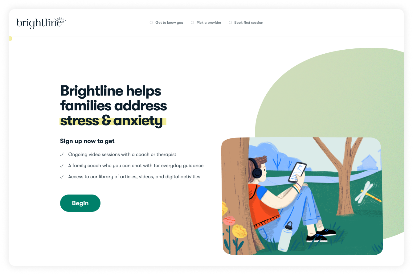
Brightline sign-up landing page: "Brightline helps families address stress & anxiety", with a list of what you get and a Begin button.
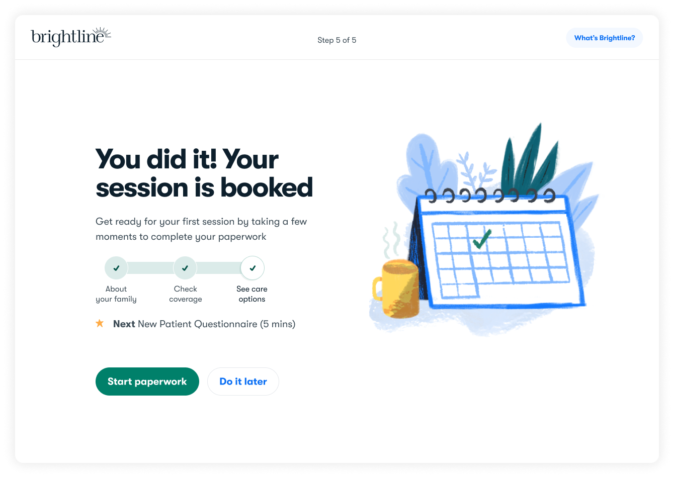
Confirmation screen reading "You did it! Your session is booked", with a three-step progress tracker and a prompt to start paperwork.
BRIGHTLINE — WHAT WE LEARNED

Guerrilla discovery in a few weeks

I put together a small tiger team and ran guerrilla discovery in a few weeks: walked prospective members through the existing flow, tested early concepts that were nothing like what we had, and pulled inspiration from outside healthcare (Farmer's Dog, Noom, TurboTax) to see how conversational, emotionally intelligent design works in high-stakes moments.

'I just feel like someone's playing with me. When am I finally going to get to the help?'
BRIGHTLINE — JOBS TO BE DONE

Four things caregivers were hiring the flow to do

'My situation is unique, and it's the most important thing to ask me about.' The old flow asked almost nothing until someone had already committed.
'Help me understand what Brightline is, in plain language.' People couldn't explain the service even after signing up.
'Don't be afraid to ask me important questions.' Relevant questions built confidence. Fewer clicks was the wrong goal.
'I'm not sure this is right for me yet.' Many people sign up while still deciding, and the old flow gave them a dead end.

Underneath all four sat four motivations that had to show up on every screen: trust, inclusivity, accessibility, and expertise.

BRIGHTLINE — WORKSHOP AND CONCEPTS

Three concepts in front of parents

A one-day workshop with clinical, care, product, and engineering. We mapped every step before the first appointment as one service, from the first site visit to the intake call, then bodystormed real intake conversations to hear how a good clinician actually asks. Three concepts came out of it and went in front of parents.
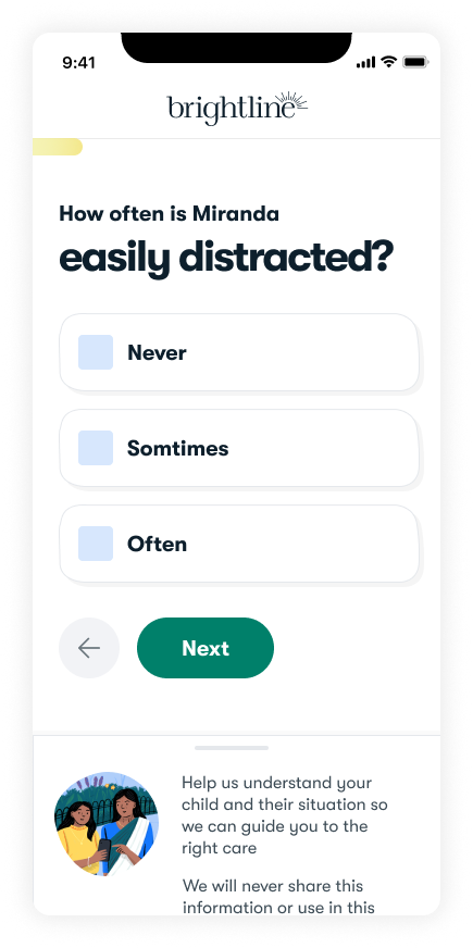
Phone screen asking "How often is Miranda easily distracted?" with Never, Sometimes and Often options and a panel explaining why the question is asked.
GETTING TO KNOW YOU — CONVERSATIONAL
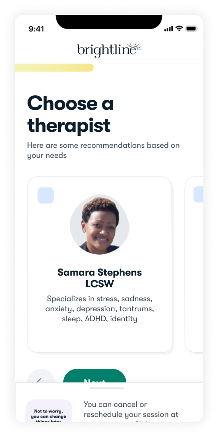
Phone screen headed "Choose a therapist", showing recommended clinician cards with photo, credentials and specialties.
JUST BOOK IT — LINEAR, MINIMAL
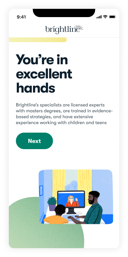
Phone screen headed "You're in excellent hands", describing Brightline's licensed specialists above an illustration of a family on a video visit.
CHOOSE YOUR OWN ADVENTURE — MODULAR
BRIGHTLINE — SERVICE DESIGN

Care team as partners

We treated the care team as a partner, not a downstream consumer. Throughout the project a small group of care team members helped us understand:

Before booking. What they need to know about a member before the first appointment.
After booking. What they need to know once the appointment is set.
From members. What they were hearing about the new experience.

Virtual workshops, regular check-ins, and ongoing feedback kept them in it from start to finish.
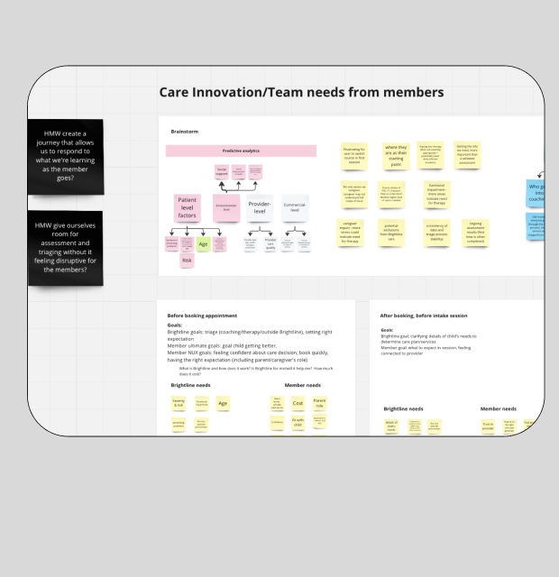
Virtual workshop board titled "Care Innovation/Team needs from members", covered in sticky notes grouped before and after booking.
BRIGHTLINE — APPROACH

Designing through a systems lens

Three templates that feel like one experience. Each has one job and holds a different kind of content, so the team could add steps without new design.
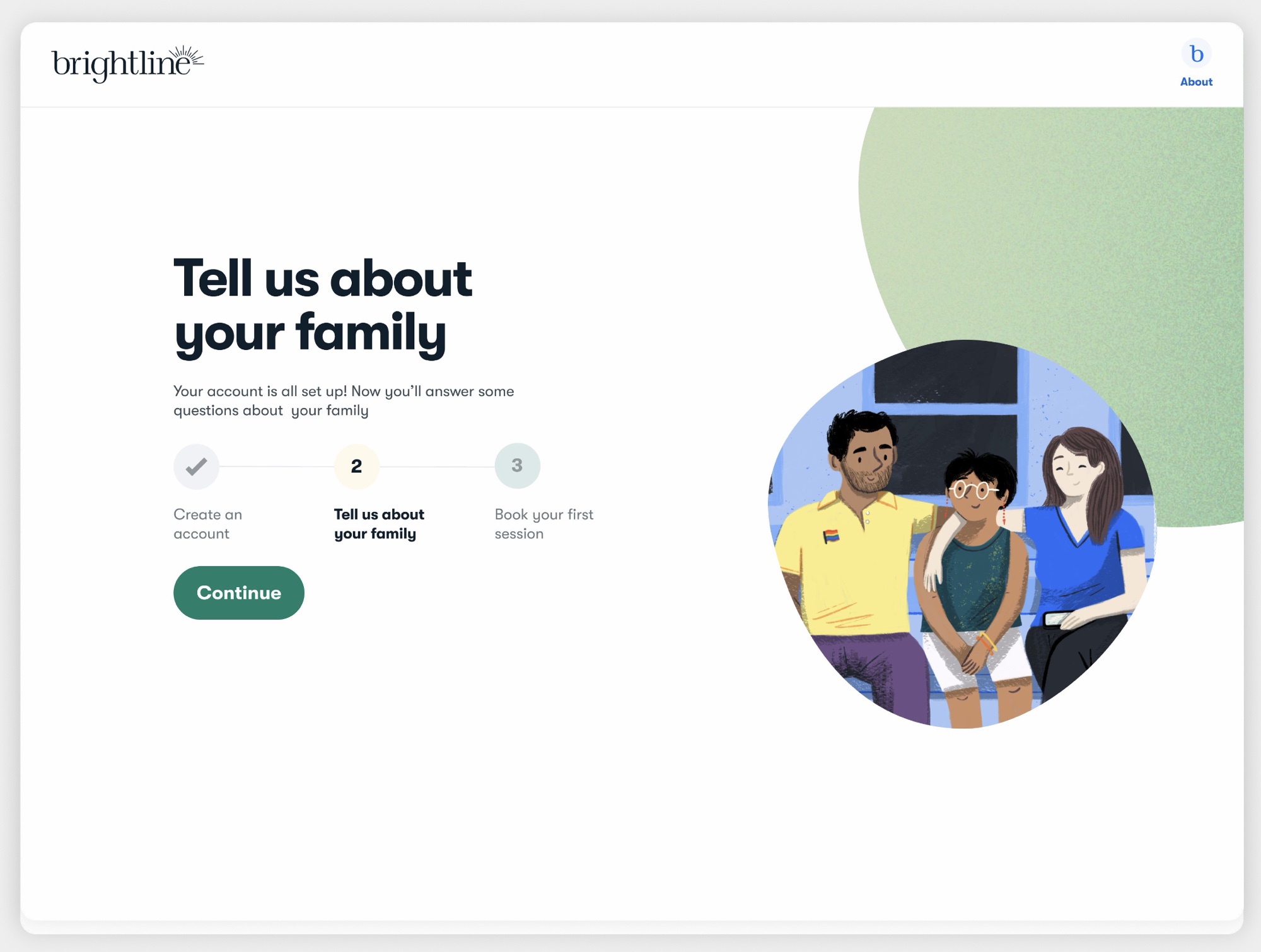
Focused. One moment or action. Used for transitions and the calls to action that matter.
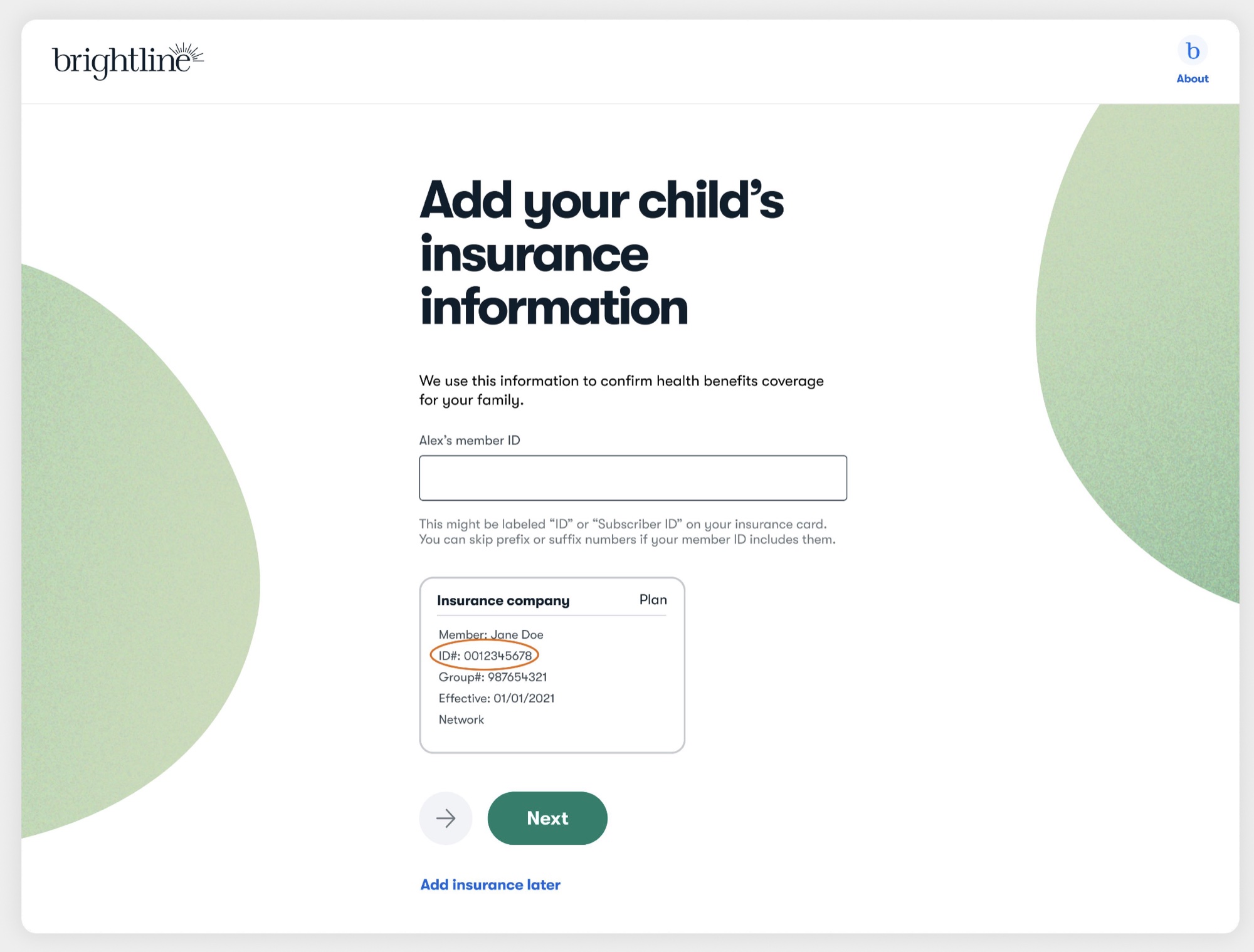
Immersive. One question at a time, which is where the conversational feel comes from.
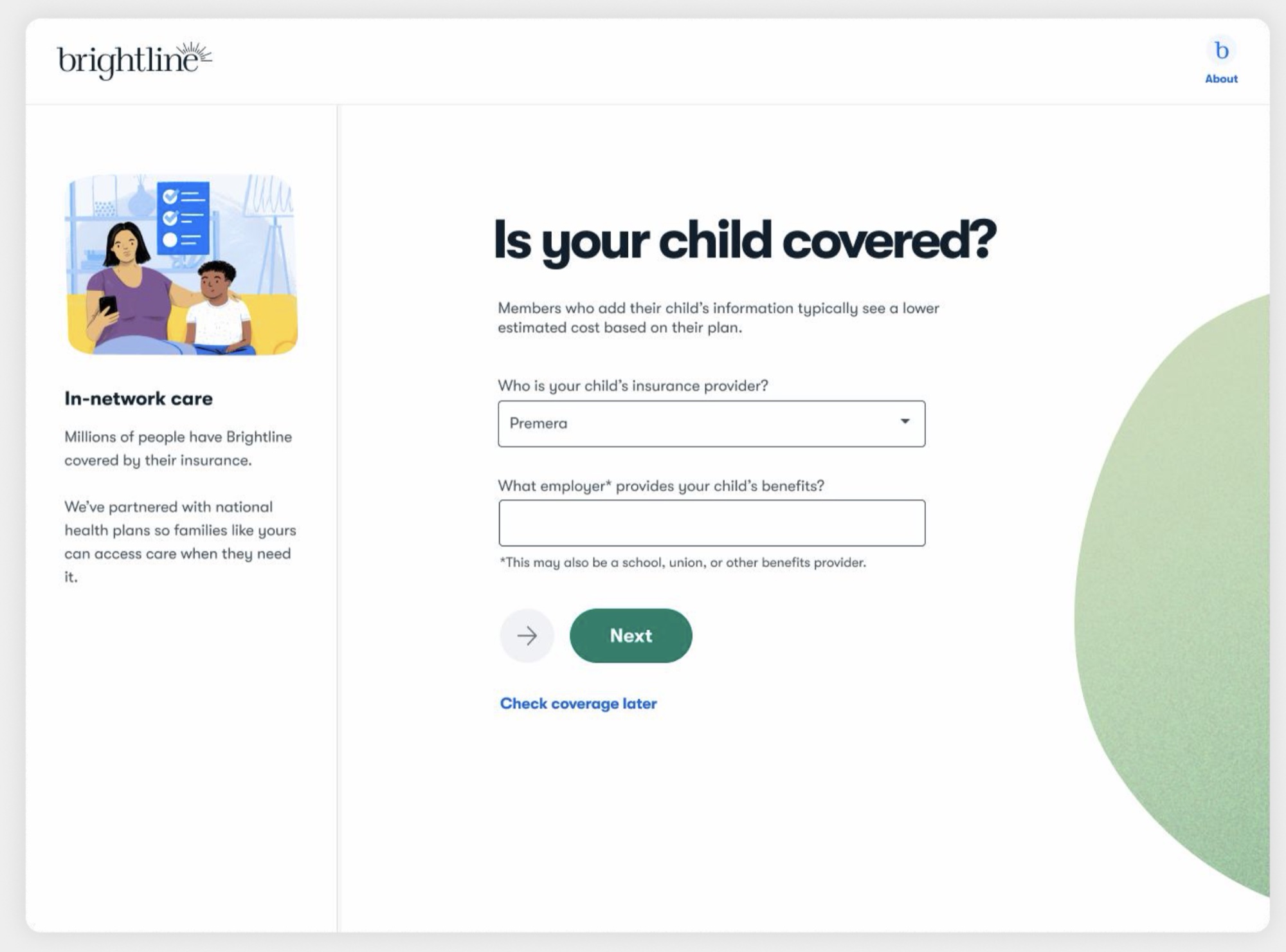
Guided. A sidebar for context and reassurance next to the actions.
Desktop screen reading "Tell us about your family" with a three-step tracker and a single Continue button.
FOCUSED
Desktop screen asking for the child's insurance member ID, one question centred on the page with an example insurance card.
IMMERSIVE
Desktop screen asking "Is your child covered?" with a sidebar explaining in-network care next to the form fields.
GUIDED
BRIGHTLINE — CLARITY

Making it (as) predictable (as possible)

Onboarding flow steps were unpredictable due to varying inputs, making a progress bar challenging.
Defined three key steps to help anchor users and clarify the process.
Added a global FAQ link for quick access to answers anytime.
Designed an insurance and cost calculator (global feature) but couldn’t develop it within the timeline.
The full experience meets WCAG 2.1 AA.
The flow header showing the three named steps — Add family, Check coverage, Get care — with a global FAQ link beside Home.
BRIGHTLINE — CLARITY

Helpful, but not disruptive

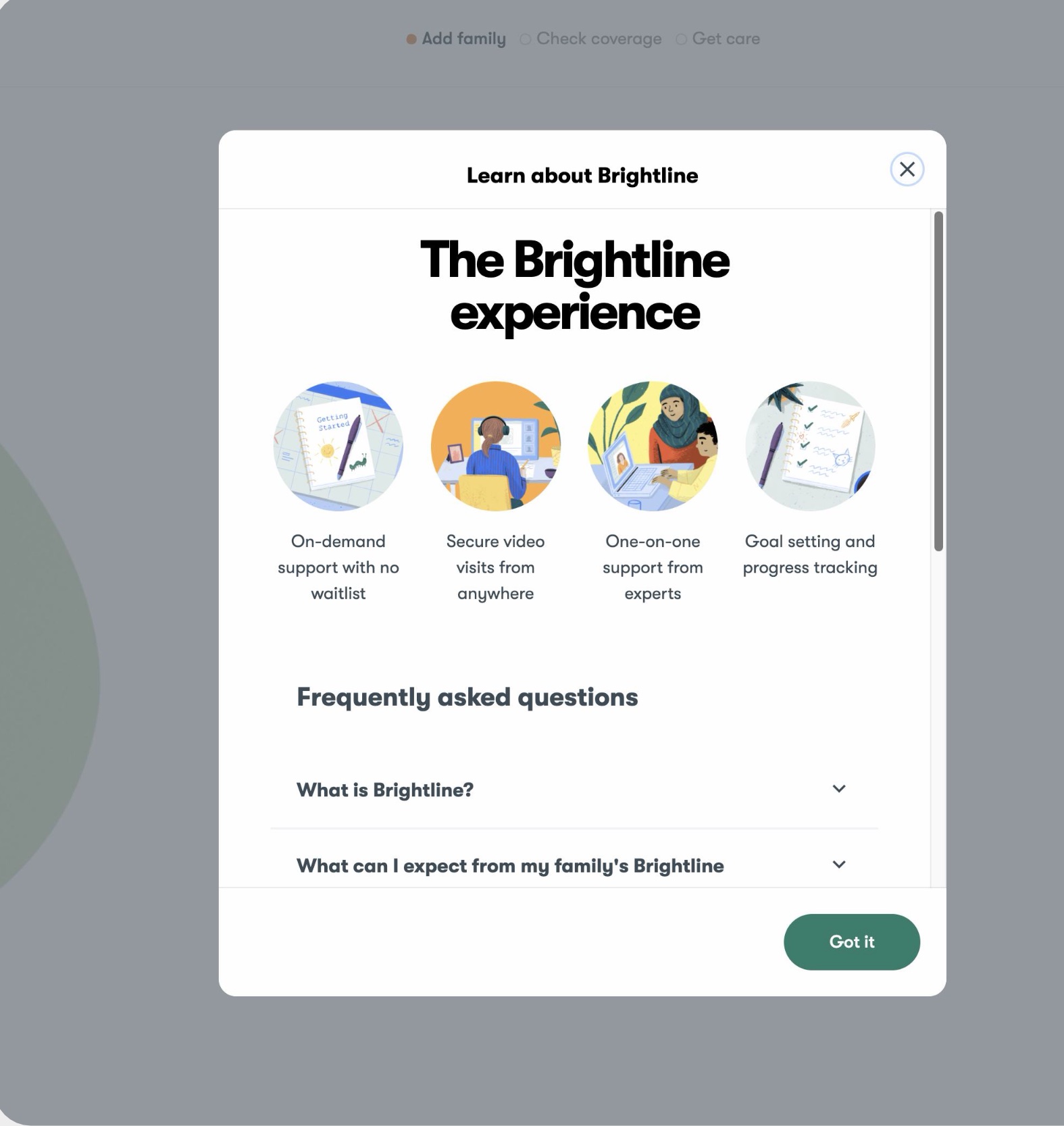
Housed FAQ in a modal so users won’t feel like the flow is interrupted and can easily navigate back to where they were.
Reminded people visually what Brightline is and how it works.
A "Learn about Brightline" modal open over the flow, showing four illustrated service benefits above a frequently asked questions list.
BRIGHTLINE — SERVICE DESIGN

Asking questions that matter

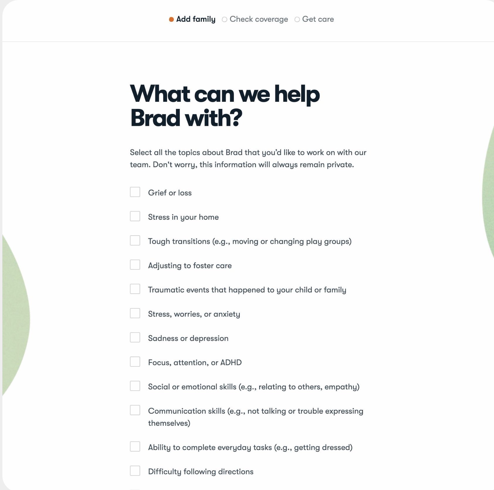
‘How can we help’ was always the first question asked in our bodystorming exercise.
Thoughtful and accessible responses co-designed with our clinical team.
Screen asking "What can we help Brad with?" with a long checklist of topics from grief or loss to focus, attention, or ADHD.
BRIGHTLINE — SERVICE DESIGN

Balancing cross-functional needs

Clinical feedback added safety and exclusionary questions, so each family is routed correctly between therapy and coaching.
I worked closely with clinical partners who needed the full safety picture for every client.
We rewrote sensitive questions, like those about suicide and eating disorders, so they felt approachable to families looking for lower-acuity care.

Safety requirements and a welcoming flow had to coexist. Neither could win outright.
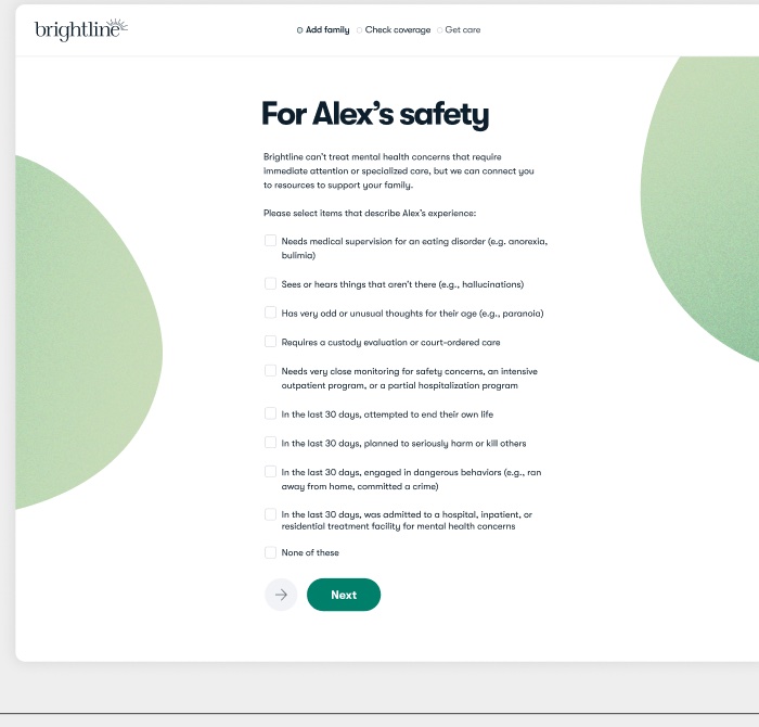
Screen headed "For Alex's safety" with a checklist of clinical safety items and a note that Brightline can connect families to other resources.
BRIGHTLINE — VISUAL DESIGN

Proving ourselves as we go

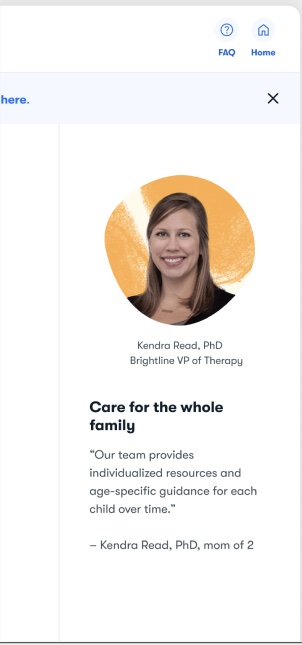
On larger screens, the extra space holds informative side panels.
The panels show who is behind the care, with real clinicians and their credentials, so trust builds while people answer questions.
Helpful context sits right next to the step it explains.
Side panel introducing Kendra Read, PhD, Brightline VP of Therapy, with her photo and a quote about care for the whole family.
BRIGHTLINE — VISUAL DESIGN

Bringing the brand back into the flow
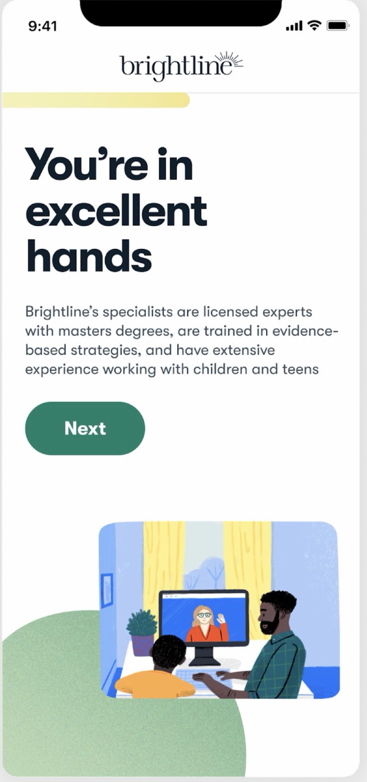
The old flow had lost the brand entirely.
We brought back the illustration, color, and warmth members already knew, so the flow looked like the company they were trusting with their kid.
Phone screen reading "You're in excellent hands", introducing Brightline's licensed specialists with the brand's illustration, colour and type back in the flow.
BRIGHTLINE — INTERACTION DESIGN

Designing a lengthy assessment

A 17-question clinical assessment had to feel fast and worth finishing.

A progress bar so people always know where they are.
The key phrase of each question in large type, so it scans quickly.
The same three answer options throughout, so people build a rhythm.
"Why do we ask this?" on every question.
Subtle ambient animation between questions.

96% of people who start the assessment finish it.
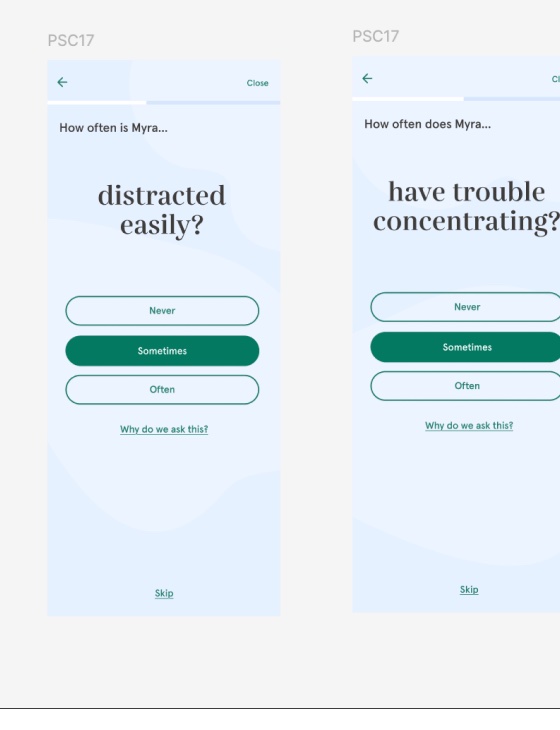
Two assessment screens side by side, each with the key phrase of the question in large type, three answer options and a "Why do we ask this?" link.
BRIGHTLINE — DESIGN CHOICES

Giving back something of value

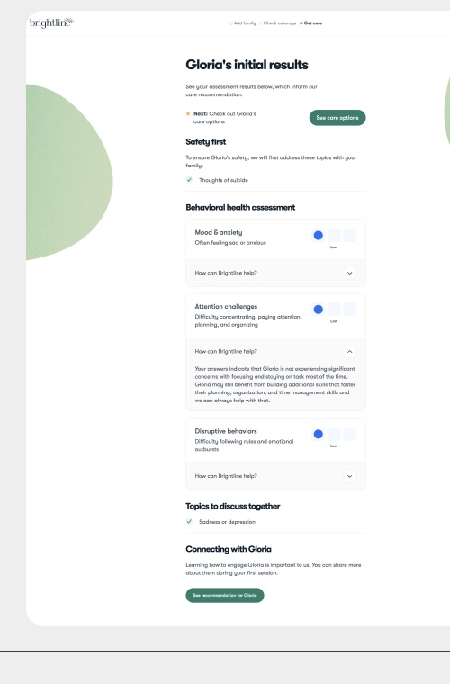
Results use scannable, judgment-free visuals.
Service education explains how Brightline will address this family’s specific needs.
The summary reflects back what people told us was important to them.
Results screen showing a family's assessment summary by area, with low-to-high indicators and expandable "How can Brightline help?" answers.
BRIGHTLINE — RESULTS

Shipped in 9 weeks

Clear questions and a clean visual system people recognized did more for trust than any reassurance copy.
35→65%
COMPLETION
16→29%
ACCOUNT CREATION
96%
INTAKE COMPLETION
4→8.75
TRUST, OUT OF 10
4→9.5
EXPERTISE, OUT OF 10
ALL
TESTERS COULD DESCRIBE WHAT BRIGHTLINE WAS, VERSUS NONE BEFORE
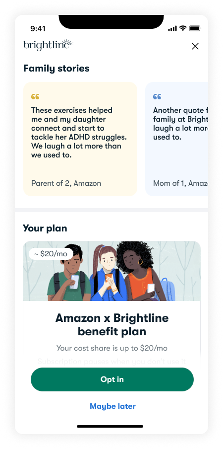
Phone screen showing family story quotes above a benefit plan card with the member's estimated monthly cost and an Opt in button.
NEXT CASE STUDY —
Storybook
CONTACT
347-852-8466 · Los Angeles, CA