Storybook

CONSULTANT AND DESIGN LEAD

Redesigning a content-heavy wellness app for discovery, engagement, and retention.

THE CHALLENGE

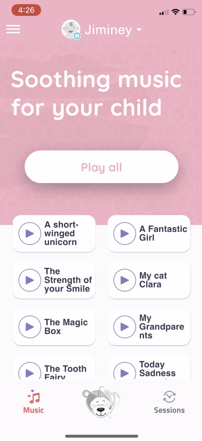
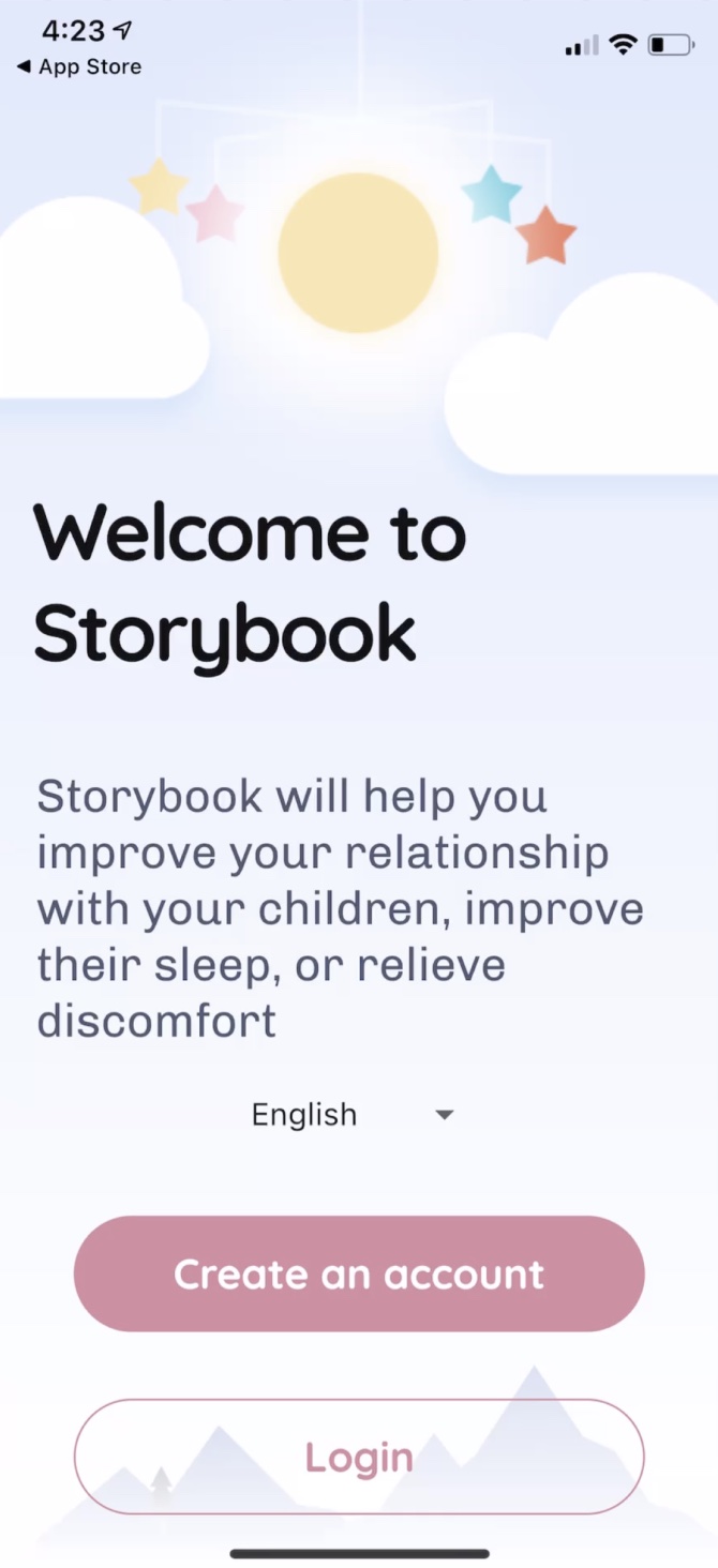
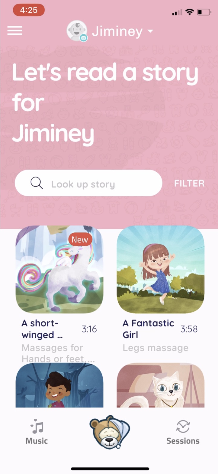
Storybook had clinically sound content created with sleep experts and child psychologists, impressively proven effective in research settings. But most users were abandoning before experiencing the value. Storybook didn't understand why, or what to do about it.
HOW MIGHT WE

How might we redesign Storybook so users could experience what resonates faster and stick around longer?

THE TASK AT HAND

What we were solving for

Wayfinding. Users couldn't navigate to content that felt relevant to their situation.
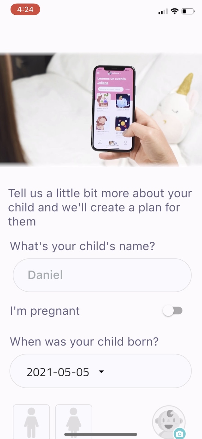
Personalization. The experience felt generic, not tailored to a user's specific needs.
Navigation. The existing nav didn't match actual user jobs or mindsets.
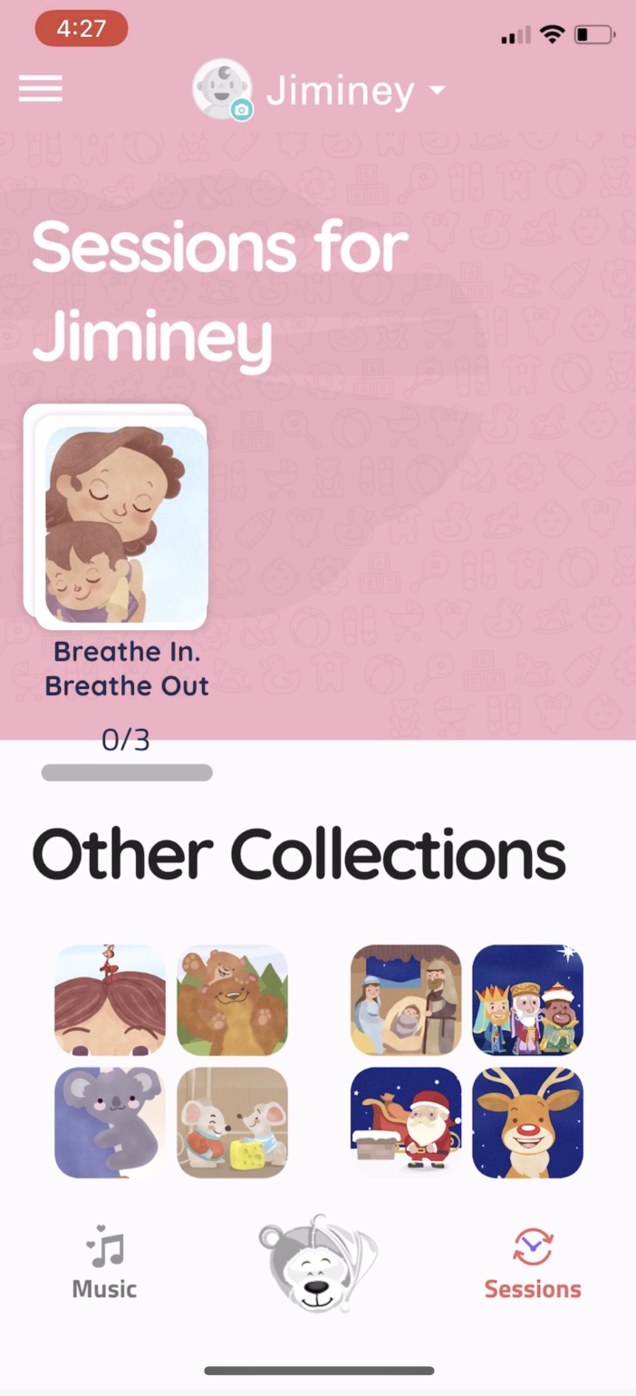
Content programs. No structured pathways, just a library to browse.
UNDERSTAND

A proper research effort to ground us
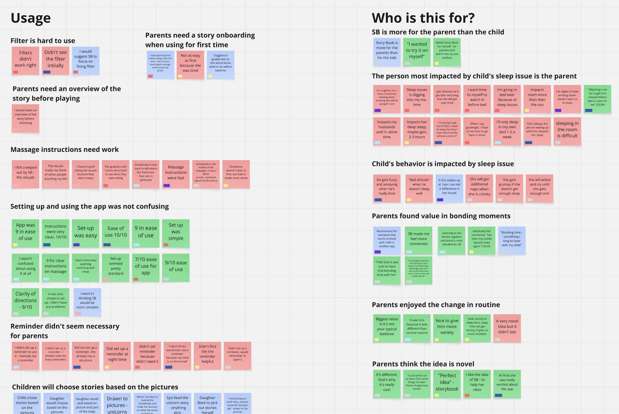
Conducted 1-on-1 interviews at the start and end of a two-week diary study
Had participants use the product over a full free trial period, completing usage surveys throughout
Ran live product walkthroughs where users showed us exactly where they got stuck
Research synthesis board grouping findings under Usage and Who is this for, with colour-coded notes on filters, massage instructions, set-up and bonding.
COLLABORATIVE SYNTHESIS

Turning research into direction

Ran a half-day design workshop with the Storybook team:
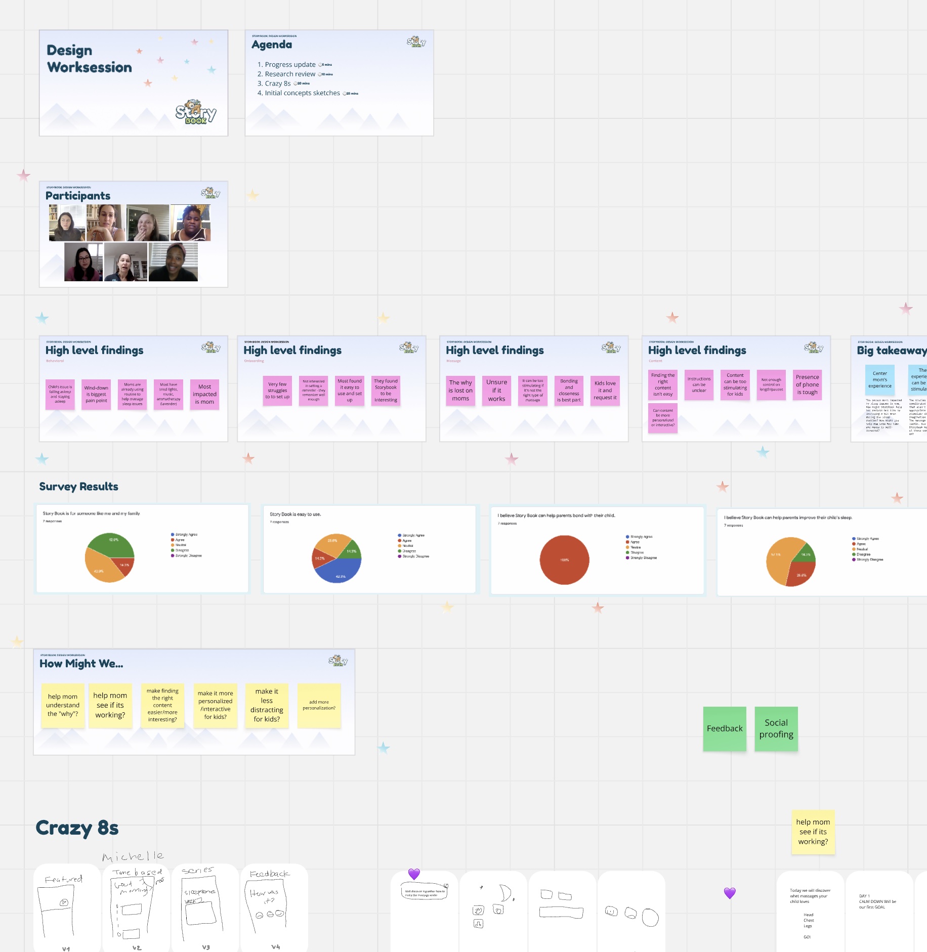
Reviewed research findings together
Co-authored "How Might We" statements
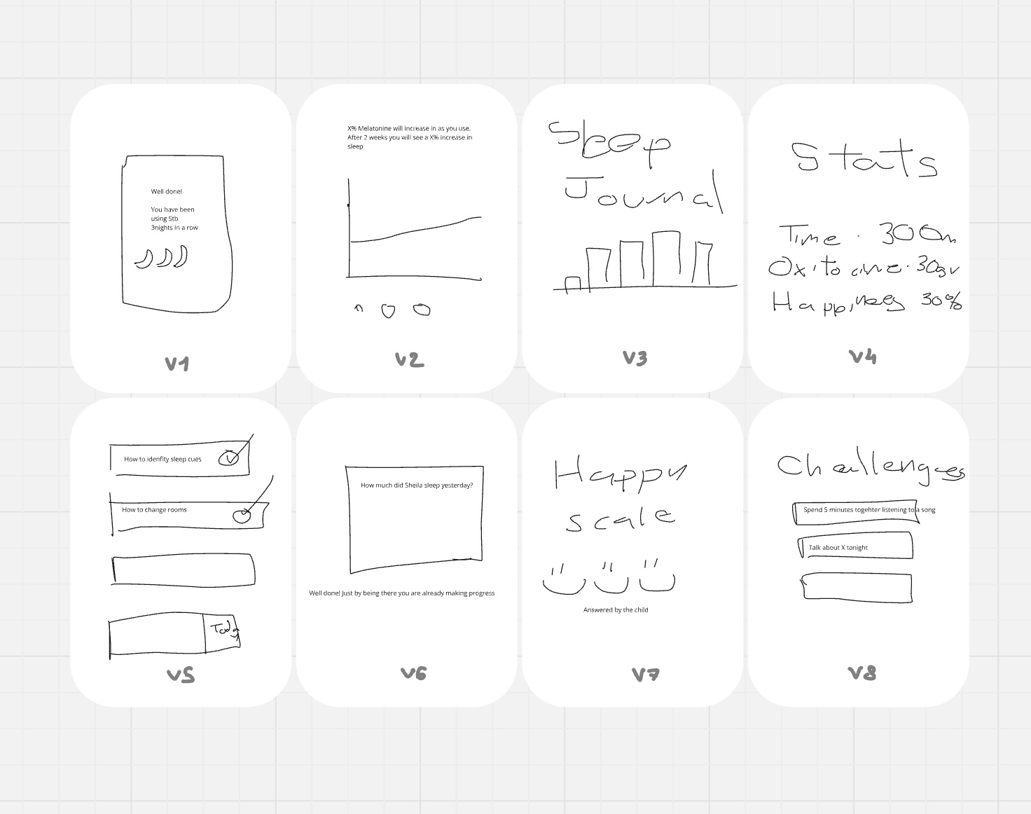
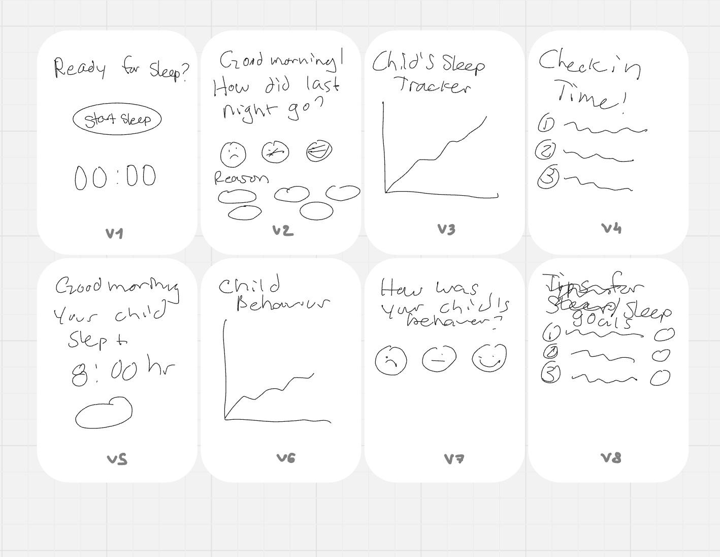
Generated ideas through Crazy-8s sketching
Defined specific focus areas for the redesign
The workshop board: agenda, participants, high-level findings by theme, survey results, How Might We statements and Crazy-8s.
Crazy-8s sketches exploring how to show progress — streaks, sleep journals, stats, a happy scale and challenges.
Crazy-8s sketches exploring check-ins — "Ready for sleep?", morning follow-ups, sleep trackers and behaviour ratings.
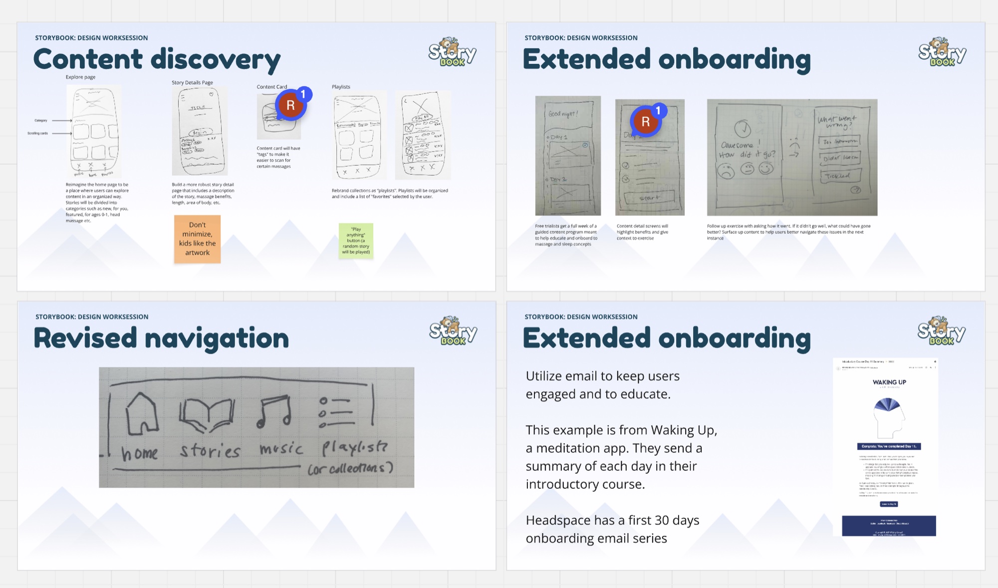
Workshop output slides covering content discovery, extended onboarding and a revised navigation sketch.
CONTENT DISCOVERY

Rebuilding the taxonomy from scratch
Audited all existing content and evaluated old categories against research findings
Ran card sorting exercises with real users to understand how they'd naturally categorize content
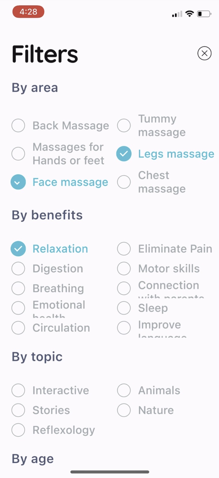
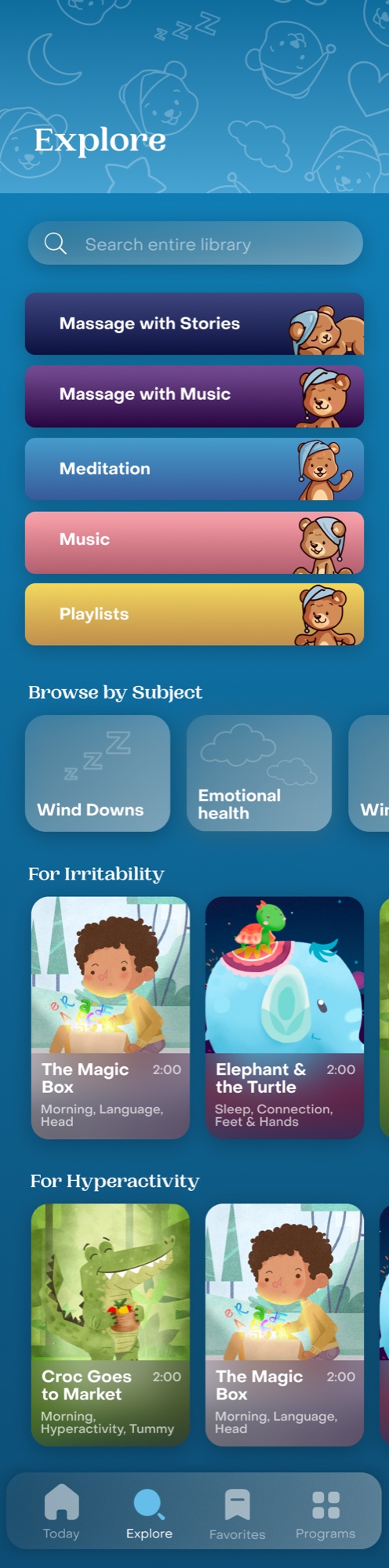
Created a new, flexible content taxonomy organized by user need in the moment, not just content type
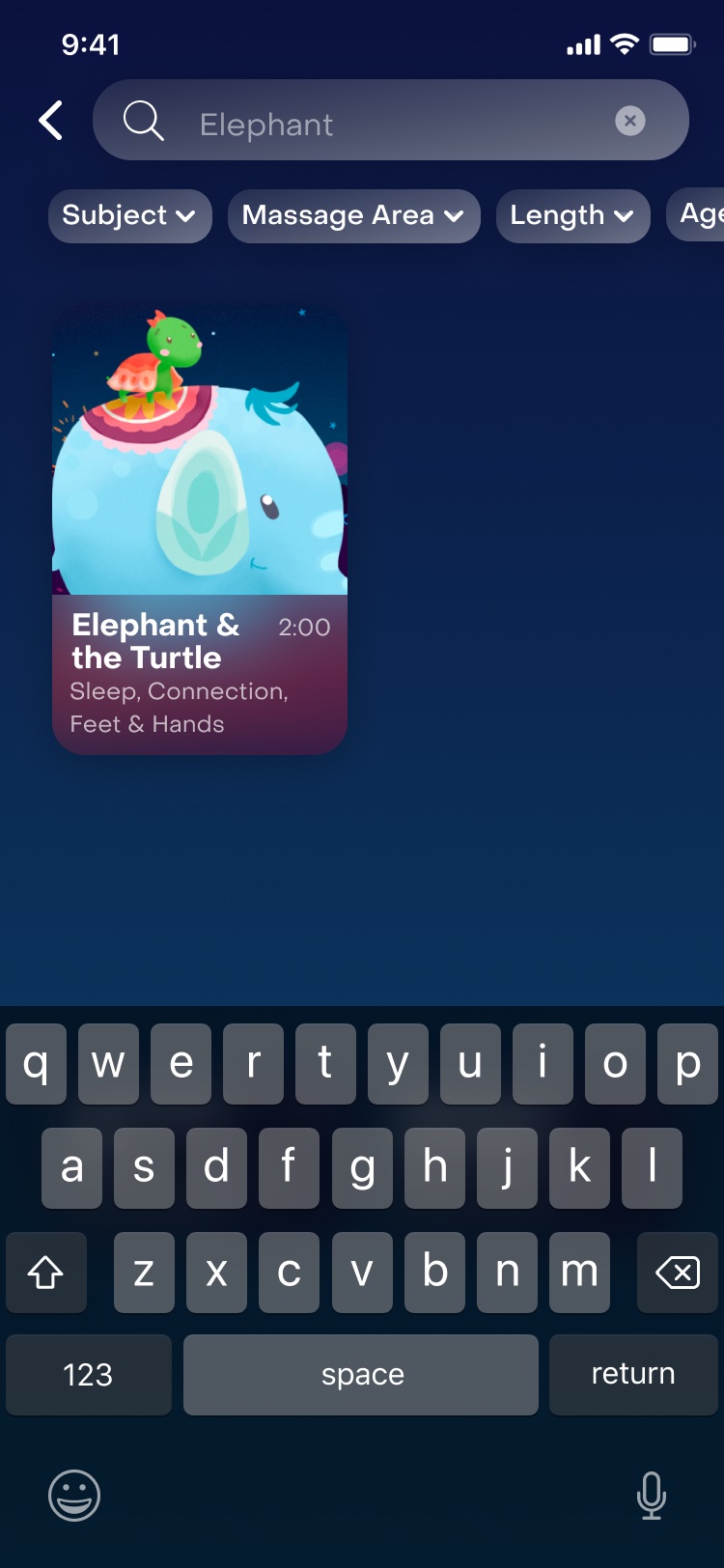
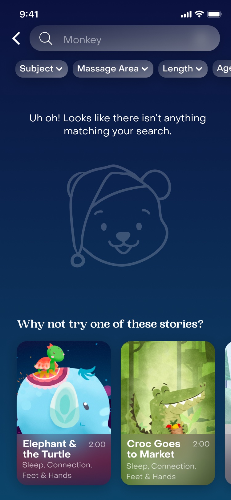
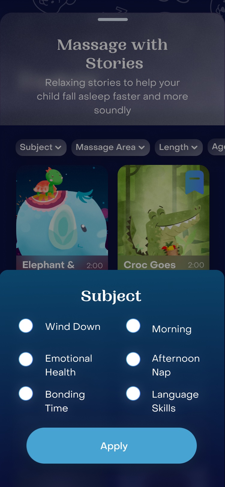
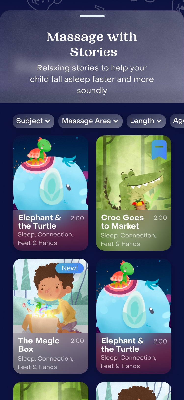
Built an Explore experience with multiple discovery modes: text search, by content type, by subject, by personalized need
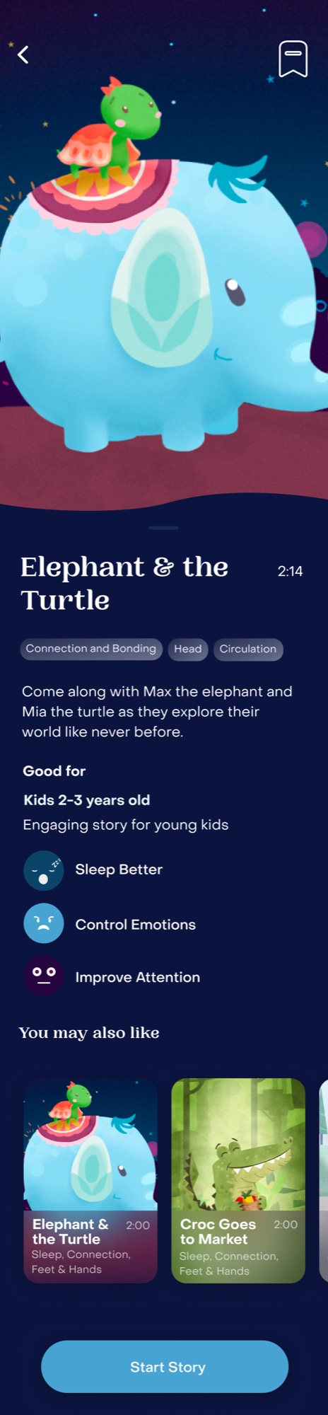
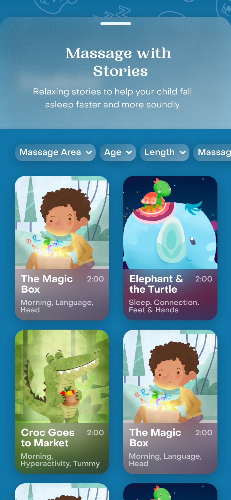
Improved content detail pages so both parents and kids could make informed selections
NAVIGATION & HIERARCHY

Nav that reflects how users actually think

Reorganized the navigation using language that matched real user jobs and mindsets:

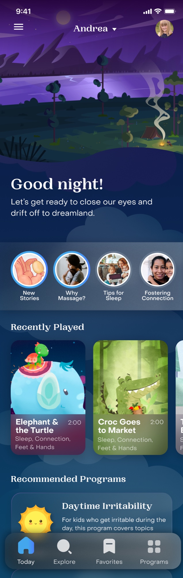
Today. Content relevant to your activity and preferences
Explore. Full content library with relevant filters and easy-to-browse categories
Favorites. Saved content
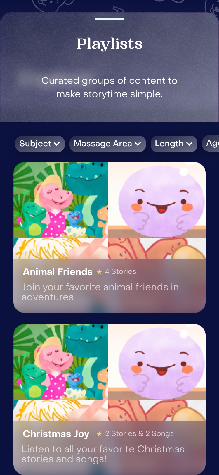
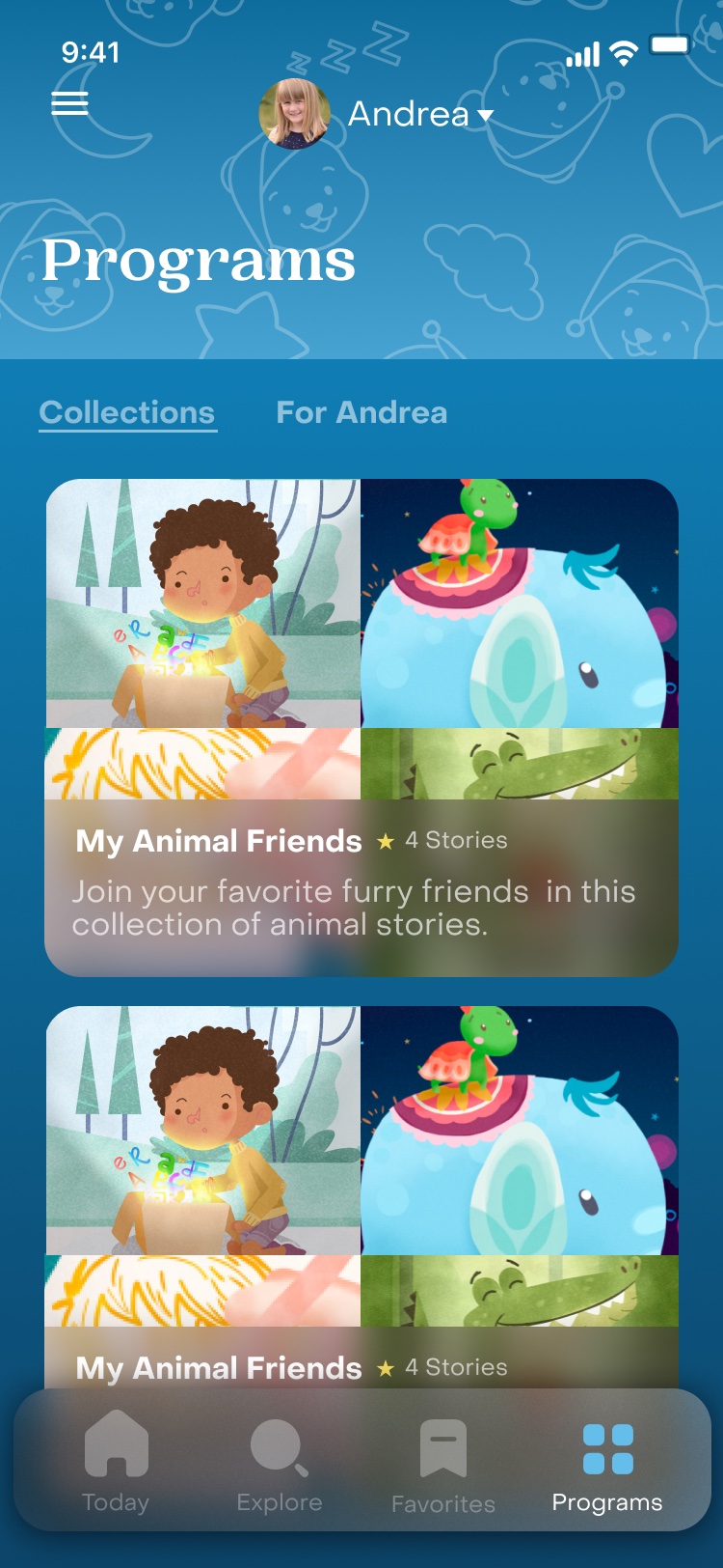
Programs. Packaged, multi-day content journeys

Previous nav used vague category labels that meant nothing to users in the moment.

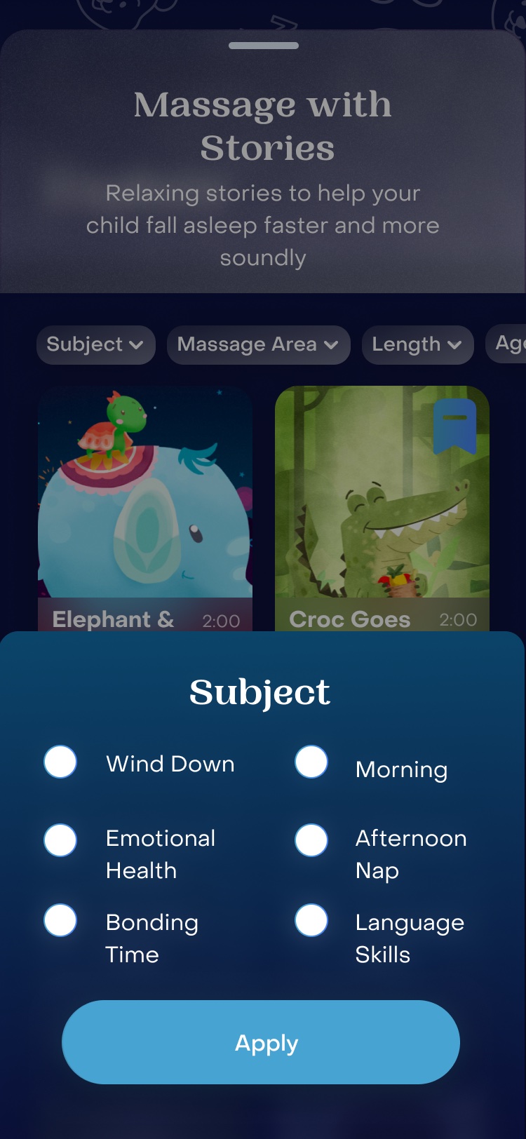
Today screen with recently played stories and recommended programs, and the four-tab nav along the bottom.Explore with the Subject filter sheet open over the story library.
PERSONALIZATION

Personal from the first minute

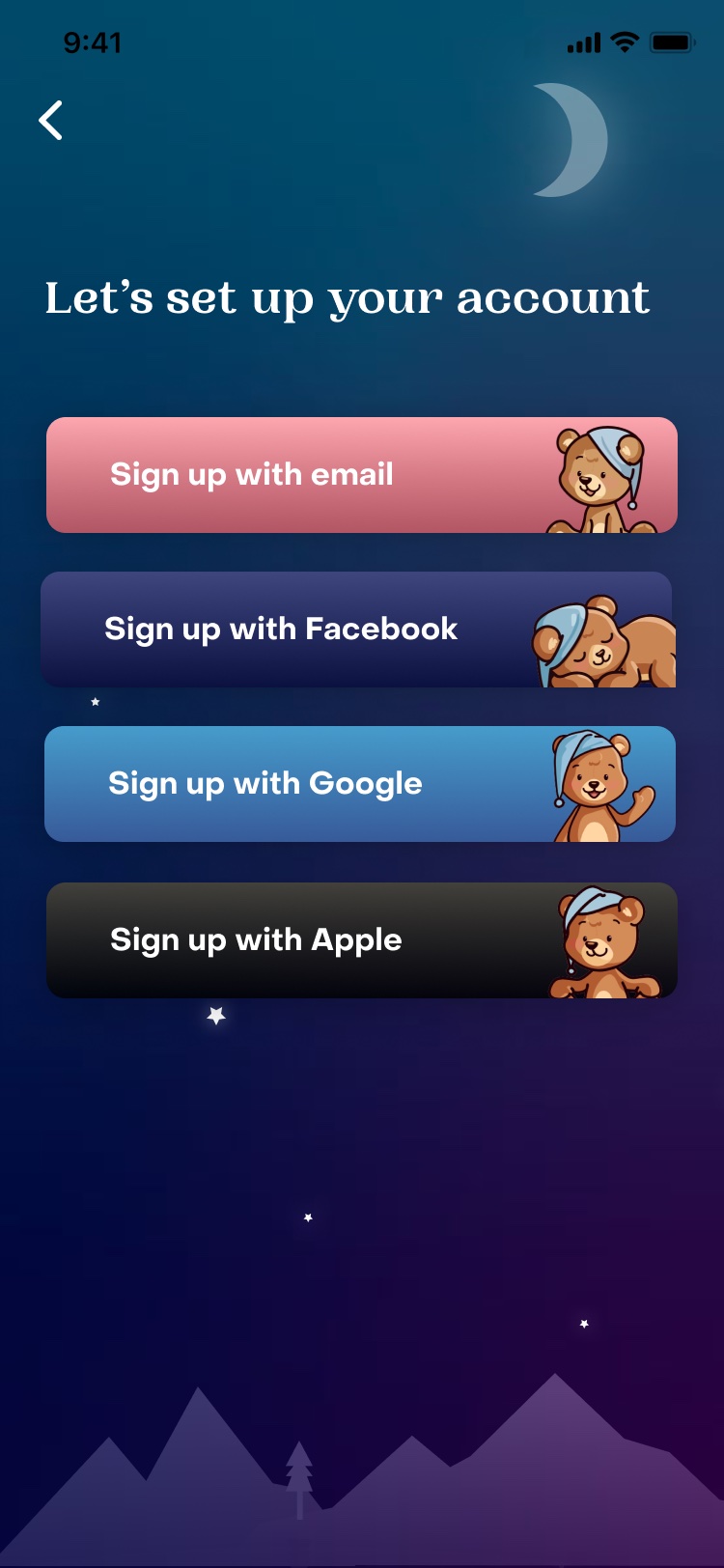
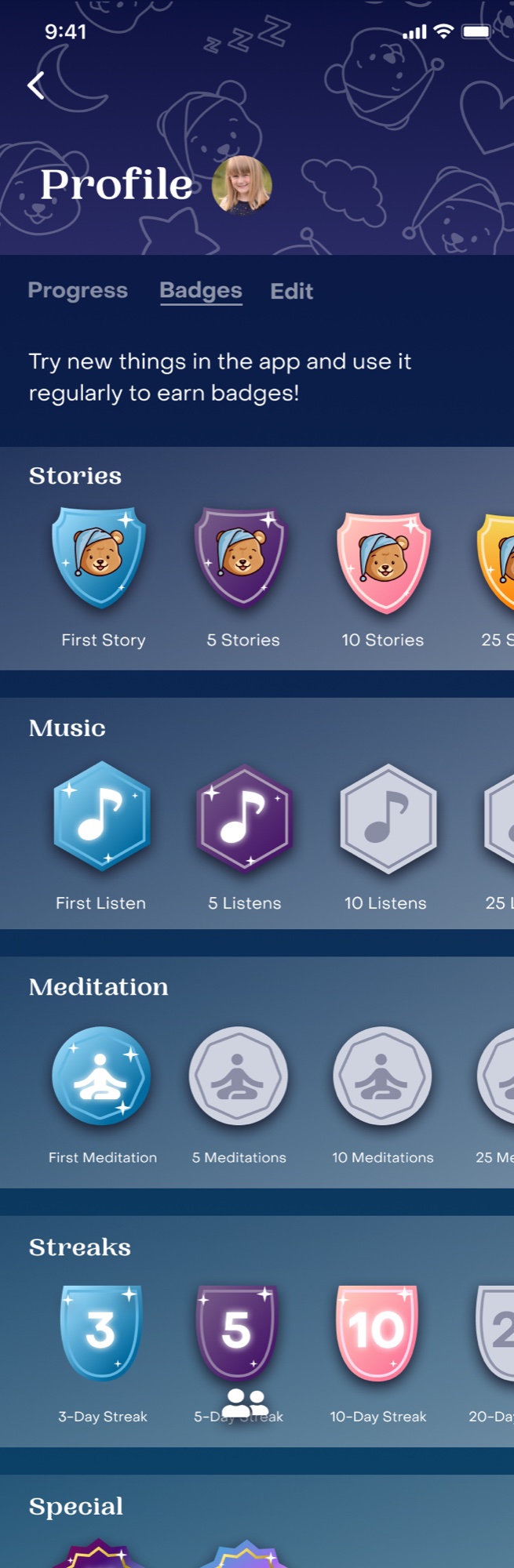
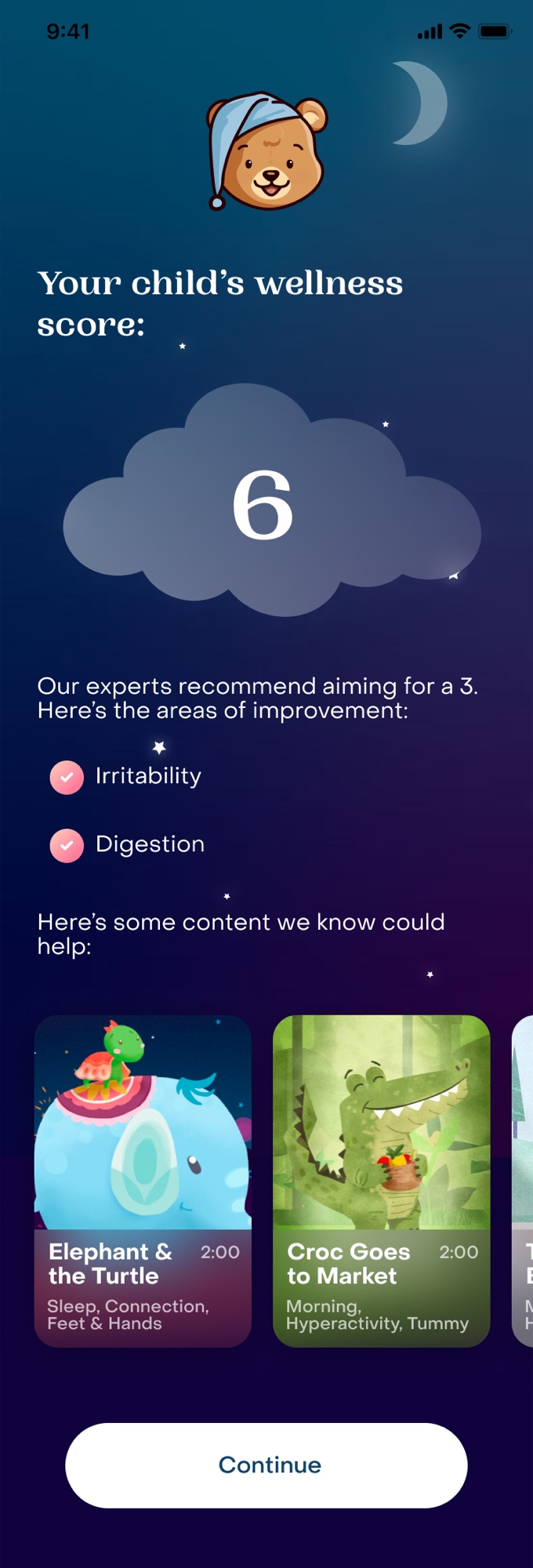
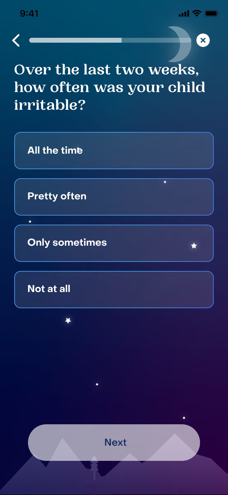
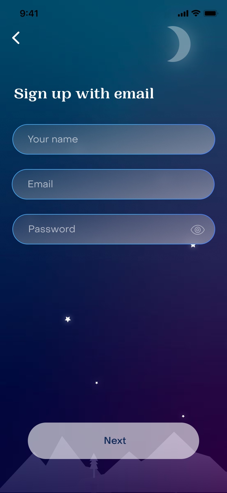
A short assessment about the child returns a wellness score and recommended content before asking for an account. Progress lives on the profile, so parents can see if it's working.
DAY MODE

Good morning, too

A light mode for daytime use, with the same structure and a brighter palette.

THE STORY EXPERIENCE

Guided, gentle, and worth coming back to

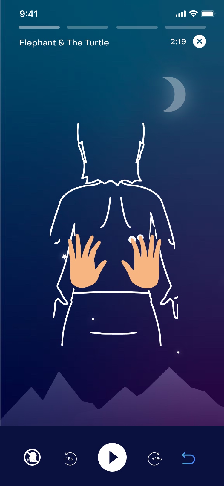
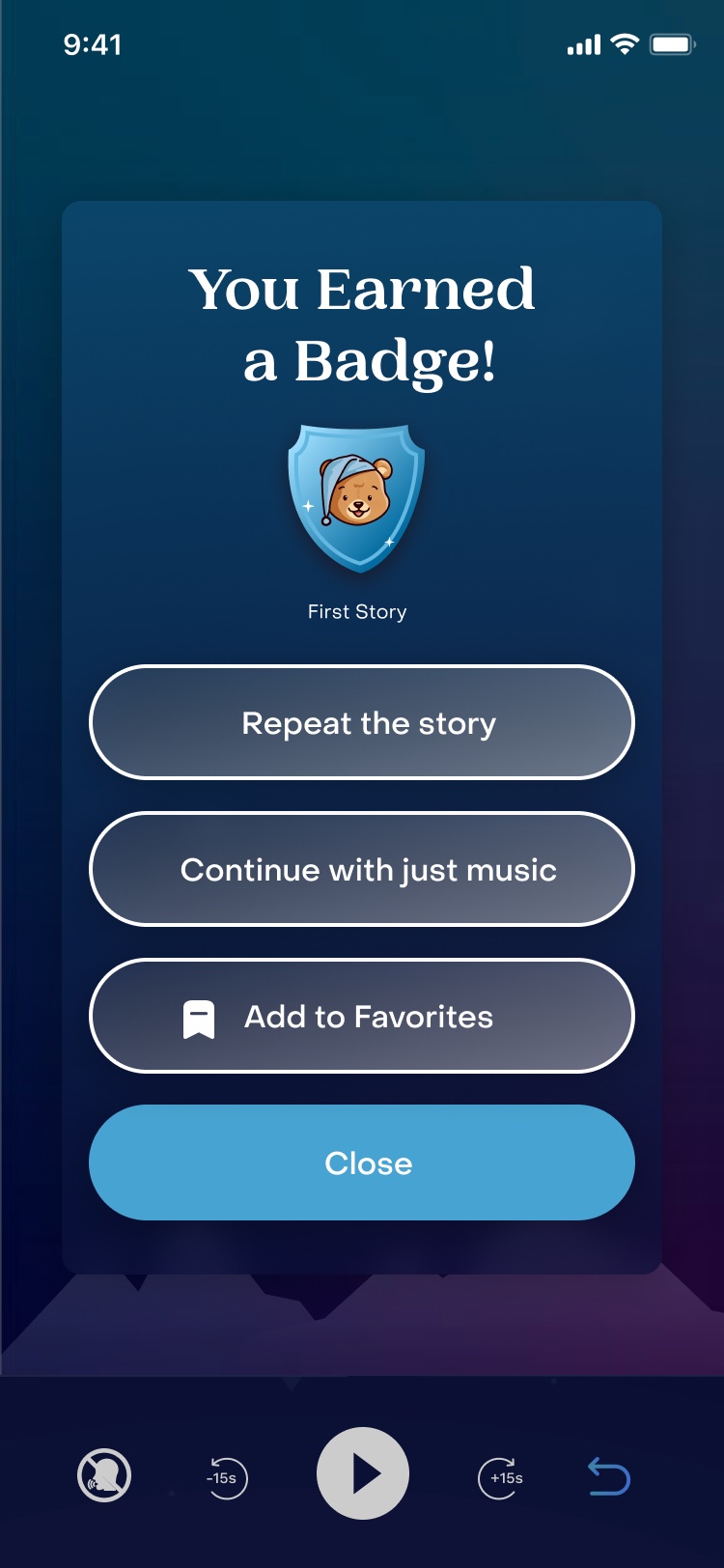
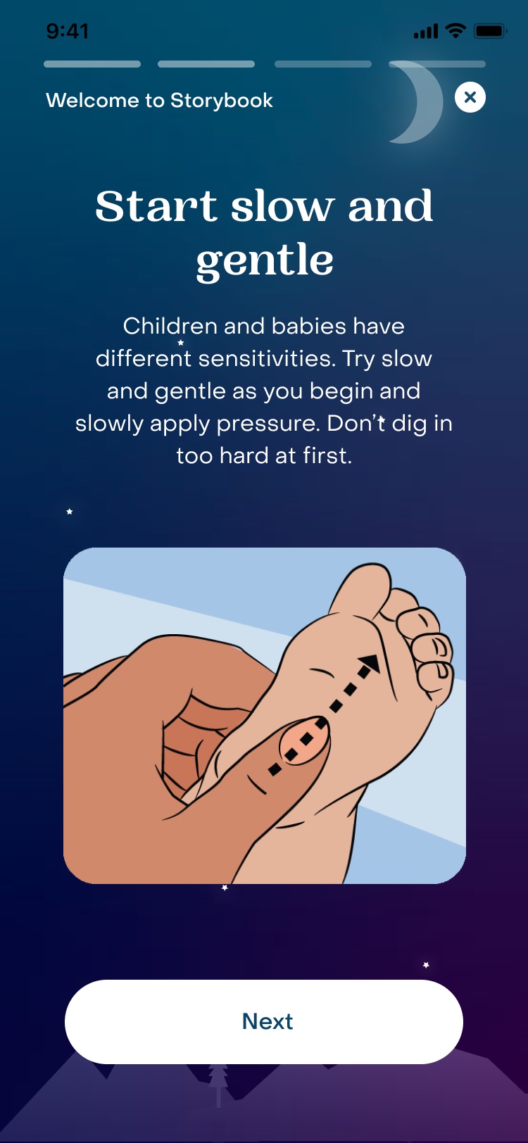
Short guidance before the first story, a player that shows exactly where to massage, and a badge at the end that invites a repeat, music, or a favorite.
WHAT I LEARNED
Content discovery is multi-modal. "Search" and "browse" are not the same thing. Users in different mindsets need different entry points into a content library.
Taxonomies should flex with the user. The most effective libraries feel like they reorganize themselves around your current need, not around the product's internal structure.
Navigation language is not a branding moment. It's a clarity moment. Use the words your users actually say.
RESULTS

Award-winning, measurable improvement.

+56%
CONTENT STARTS
+15%
NPS
WINNER
NATIONAL PARENTING PRODUCT AWARDS
WINNER
CHILDTECH PRODUCT AWARD
↑
APP STORE RATING
APP OF THE DAY
APP STORE
NEXT CASE STUDY —
Headspace Health
CONTACT
347-852-8466 · Los Angeles, CA